
Overview
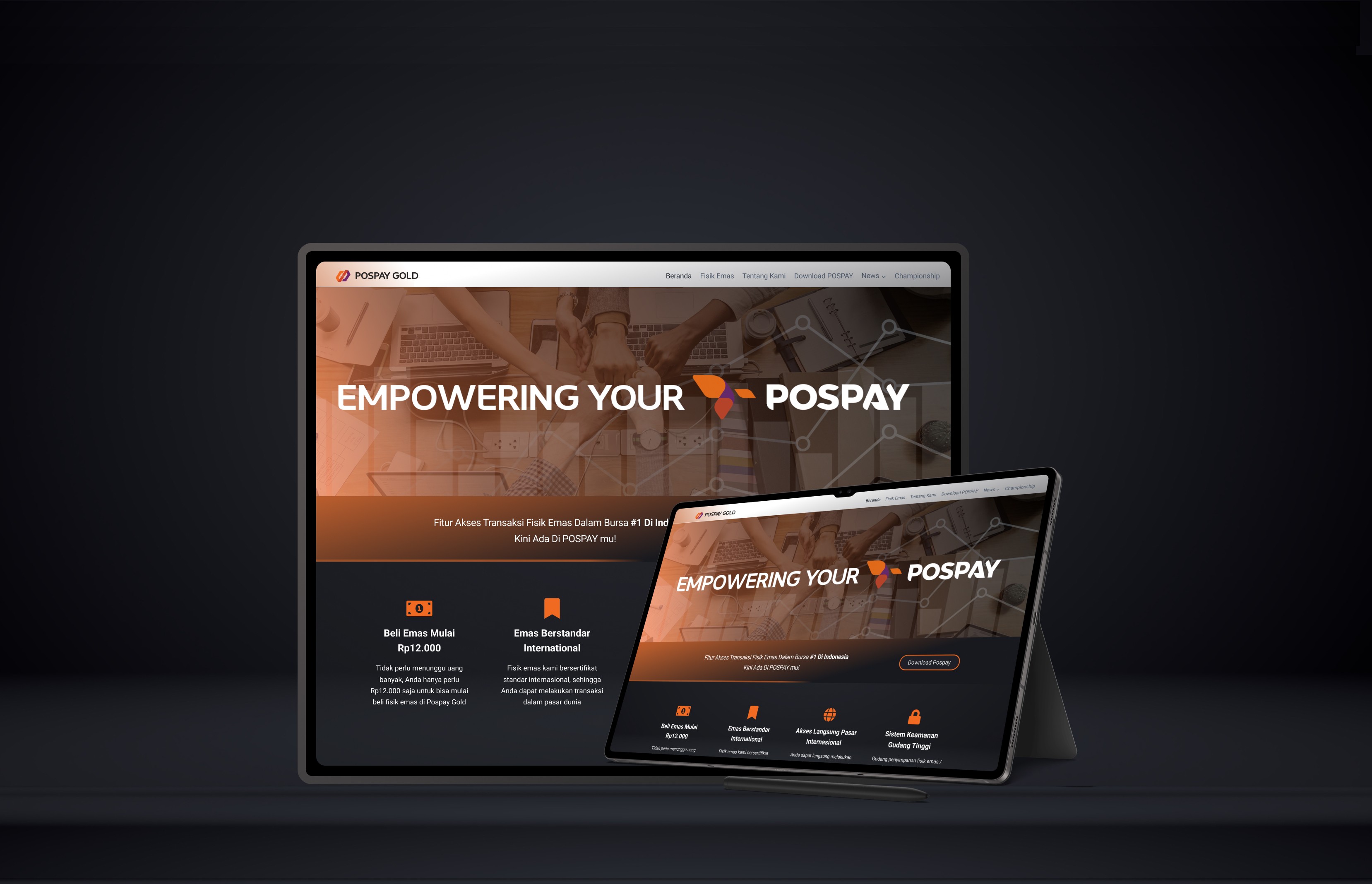
Here I am posting my work project at PT Bullion Ecosystem International in collaboration with PT Pos Indonesia (Persero) on the PospayGold product. But for this time, I will share an exploration of my design style that has no boundaries. So previously the design I made on the original website was a formal design, and I would like to share more of my exploration here.
Initial Analysis
Before exploring a redesign, I conducted an in-depth analysis of the existing PospayGold website design. Some important points of concern are:
Visual hierarchy: The design elements are not well organized, making it difficult for users to focus on the main information.
Interaction: Buttons do not have clear visual feedback when clicked.
Overall impression: The design feels flat and lacks visual interest.
Design Concept
Based on the analysis, I decided to implement a more dynamic and modern design concept by utilizing the shadow technique. Shadows were chosen because they have several advantages, namely:
Creating depth: Shadows give the impression that design elements have volume and depth, making them look more alive.
Strengthens visual hierarchy: By adjusting the intensity and direction of the shadows, important elements can be distinguished from the rest.
Adds a sense of elegance: Proper use of shadows can give a design a luxurious and professional feel.


