Overview
Metalgo's decision to rebrand was not just a small change. This rebranding was done because the previous visual identity and user experience (UX) were felt to be outdated and no longer represented the brand's progressive vision and ever-evolving technological innovations. The ultimate goal was to improve brand perception, strengthen user trust, and provide a more intuitive and visually appealing digital experience. In my role as Webmaster, I am responsible for the entire design process, from user research to visual implementation.
Problem Statement
Navigation Complexity: Users often struggle to find important information or specific investment features due to unintuitive navigation structure and scattered information.
Low Visual Consistency: Inconsistencies in visual elements across different touchpoints (website, mobile view, marketing materials for champaign) that weaken brand identity and create a non-cohesive experience.
Lack of Visual Appeal: The website lacks appealing visuals and fails to stand out amidst the competition of other digital platforms, leading to higher bounce rates and shorter session times.
Research
I analyzed leading investment platforms and digital ecosystems to identify best practices in UI/UX design, visual trends, and effective communication strategies. I found that competitors had more minimalistic and interactive designs.
Ideate
I created low-fidelity wireframes for key pages such as the Home, Product Detail Pages, and Campaign Page. Focus on the placement of key elements, information hierarchy, and clear calls-to-action, to ensure the most efficient user flow before adding visual details.
Designing

All pages have a dynamic hero section featuring interactive visuals of the Metalgo ecosystem, which instantly catches the visitor's attention. The use of informative cards.
Presents investment information with a clear hierarchy, using engaging data visualizations and supporting illustrations to explain complex concepts.
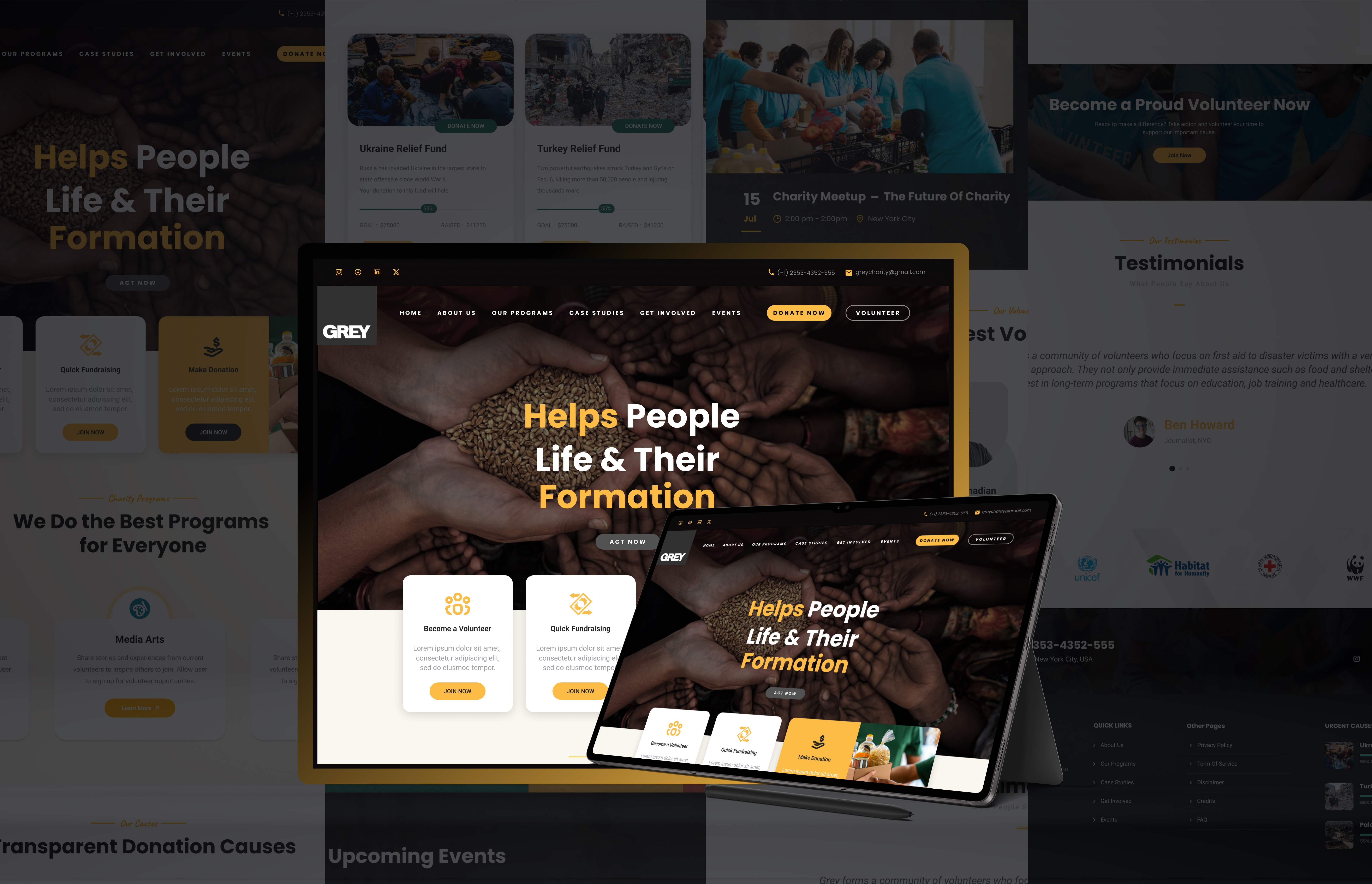
All mockups are created with mobile-first principles, ensuring a seamless experience and visuals that remain eye-catching across multiple devices, from desktops to smartphones.
Testing & Iteration
I conducted a testing session with 10 target users. Users were given a task like "Find information about us"
I found and provided the following iterations:
Findings: Some users were still confused about the legality and specific use of the Metalgo app.
Iteration: We added informative tooltips and a more accessible FAQ section to explain it.
Findings: Users wanted clearer visualization of pricing data.
Iteration: We added dynamic price charts to the page that update in real-time from tradingview.