
Visual Redesign ABI Website
Overview
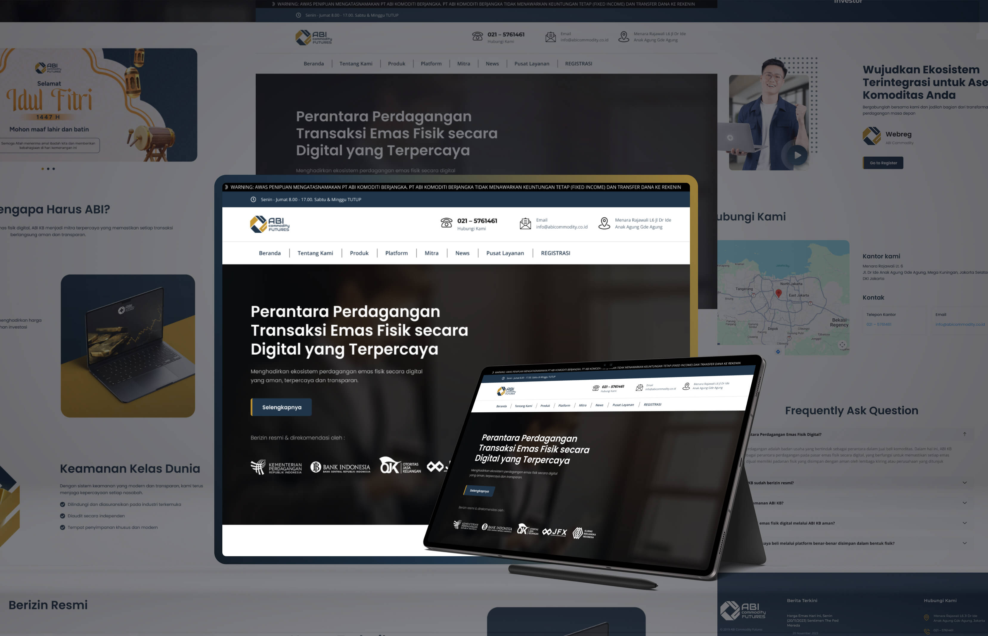
ABI Commodity Futures' decision to redesign its digital presence was a strategic move to modernize its visual identity and optimize user experience (UX) for the Indonesian commodity trading market. The core goal was to establish a professional, secure, and accessible platform that aligns with the company’s reputation as a regulated, trustworthy brokerage. As the Web Designer, I led the end-to-end design process, transforming the platform into a modern digital hub that builds confidence for both existing clients and prospective investors.
Problem Statement
Information Accessibility & Navigation: Users often found it challenging to locate essential information regarding service details, and regulatory compliance. The legacy structure suffered from cluttered navigation, which impeded user conversion.
Trust and Professionalism Gap: Given the nature of commodity trading, credibility is paramount. The previous design failed to effectively highlight the company's status as a regulated entity, potentially causing apprehension among new users.
Responsiveness & Visual Modernization: The older interface lacked a cohesive design language across different devices, leading to inconsistent user experiences. A comprehensive visual overhaul was necessary to reflect the company's commitment to technological excellence and transparency.
Research
I conducted a competitive audit of industry-leading commodity brokerage platforms in Indonesia and internationally. My research focused on identifying UI/UX best practices for fintech platforms, particularly how they communicate complex regulatory information and financial services. Key findings indicated that successful competitors prioritize a clean, minimalist aesthetic, intuitive "Call-to-Action" (CTA) buttons, and clear visibility of licensing and regulatory logos to instill immediate user confidence.
Ideate
Based on my findings, I developed low-fidelity wireframes to reorganize the information hierarchy. Key focus areas included:
Hero Section Optimization: Designing a high-impact header that clearly articulates the company’s value proposition.
Efficient User Experience Flow: Strategically placing internal link buttons (CTA) to seamlessly guide users through all pages of the website, providing clear information about the company profile.
Regulatory Transparency: Ensuring that compliance information (legal status and supervision) is visually prominent throughout the user journey.
Designing
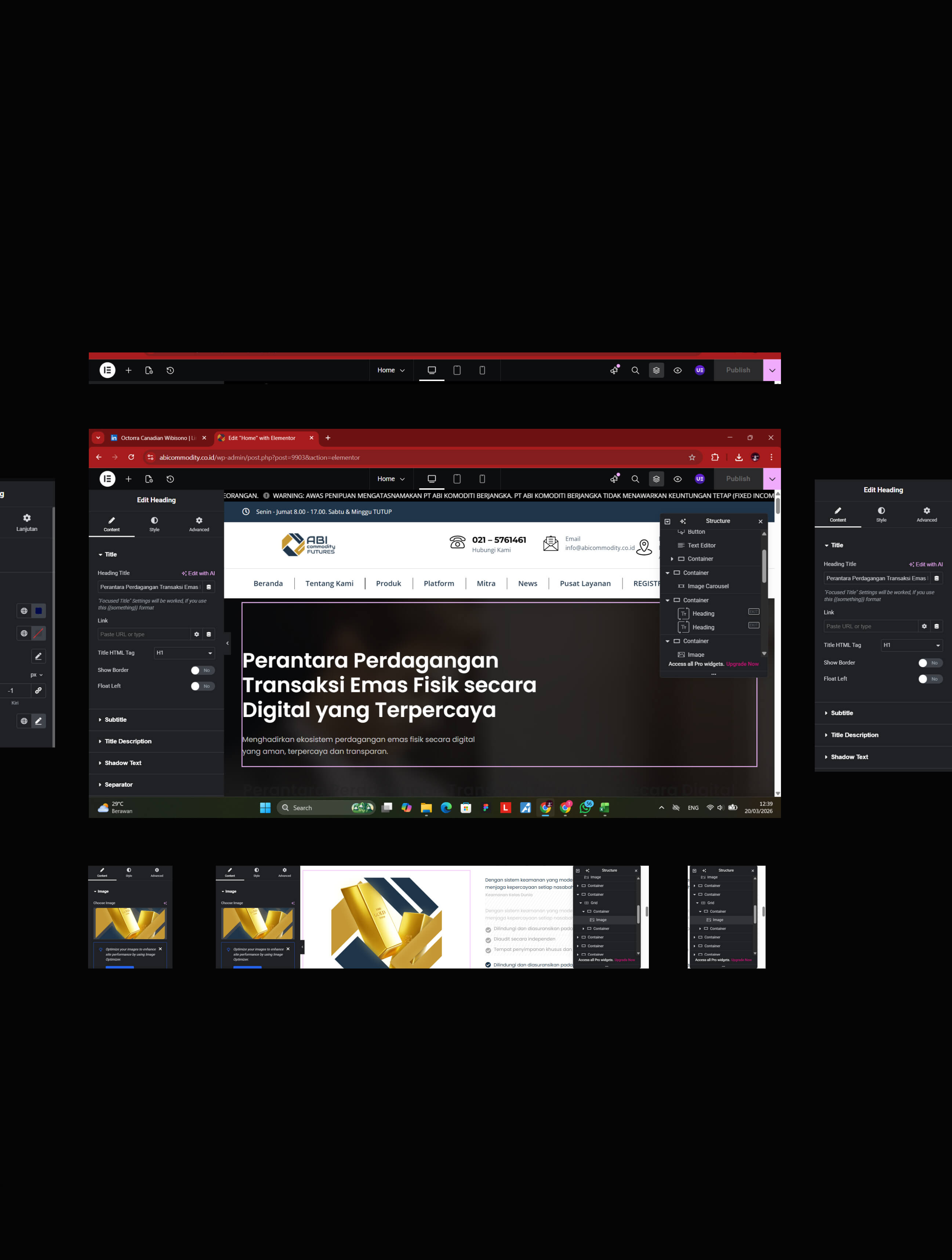
Modernizing the UI: I implemented a professional color palette and a structured layout to guide users logically through the homepage.
Mobile-Web Responsive: Ensuring that the platform remains fully functional and visually sharp on mobile devices, which is critical for clients seeking more detailed information about ABI.
Clear Visual Hierarchy: Utilizing informative cards and clean typography to break down complex trading information into digestible modules, making the platform more user-friendly for both novice and experienced traders.

