
Fitness Tracking Dashboard

Overview
The Fitness Tracking Dashboard is a comprehensive health management interface designed to bridge the gap between raw data collection and actionable user insights. Developed as part of an internship challenge for CognoRise InfoTech, the primary objective was to create a centralized "Health Command Center" that empowers users to monitor their physical activities, nutritional intake, and recovery cycles within a single, cohesive ecosystem.
Problem Statement
Many fitness applications suffer from "Data Fatigue", Where users feel overwhelmed by cluttered charts:
The Challenge: How can we present high-density information (Steps, Running time, Calories, Blood type, Sleep, Protein, and Water intake) without inducing cognitive overload?
The UX Gap: Existing trackers often separate "planning" from "results" (stats), creating a fragmented user journey.
Objective: To revitalize the fitness tracking experience through a visual first approach that prioritizes daily goals and simplifies progress tracking.
Research
During the research phase, I identified that the user requires instant validation of their daily goals.
User Persona: A goal-oriented individual who balances professional life with fitness and needs a "command center" for their health.
Information Hierarchy: I categorized data into three distinct layers based on urgency:
The Pulse (Essentials): Real-time activity and caloric burn.
The Plan (Recommendations & Upcoming): Actionable steps for the next few hours.
The Foundation (Calculations): Long-term nutritional and hydration tracking.
UX Writing Strategy: I moved away from robotic labels. Instead of "Data," I used "Essentials", instead of "Food," I used "Calculations" to imply a more precise, scientific approach to nutrition.
Ideate
This idea is heavily focused on UX comfort:
The Tone: Calm, professional, yet deeply motivational.
Key UX Writing Decisions:
Greeting: "Good Morning, Octorra! Ignite your passion..." Using active verbs like Ignite and Pursue to trigger an emotional response upon opening the app.
Activity Naming: Instead of "Workout 1" I used descriptive, benefit driven titles: "Master the Plank," "Lunch Break Burn," and "Beginner's Barre Blitz." This tells the user exactly what they will achieve and when (e.g., "10 Minute After Workout").
Status Microcopy: Using "10% Increment" and "Hours of Sleep" with specific minute counts to provide granular, satisfying feedback.
The Power of Three Layout: Organizing the layout into three distinct columns, Navigation (Left), Primary Metrics (Center), and Personal Profile/Schedule (Right) to optimize the scanning behavior.
Gamification & Micro Conversions: Implementing the "Weekly Progress" bar and "Recommended Activity" cards to provide users with immediate, low barrier tasks to complete.
Designing
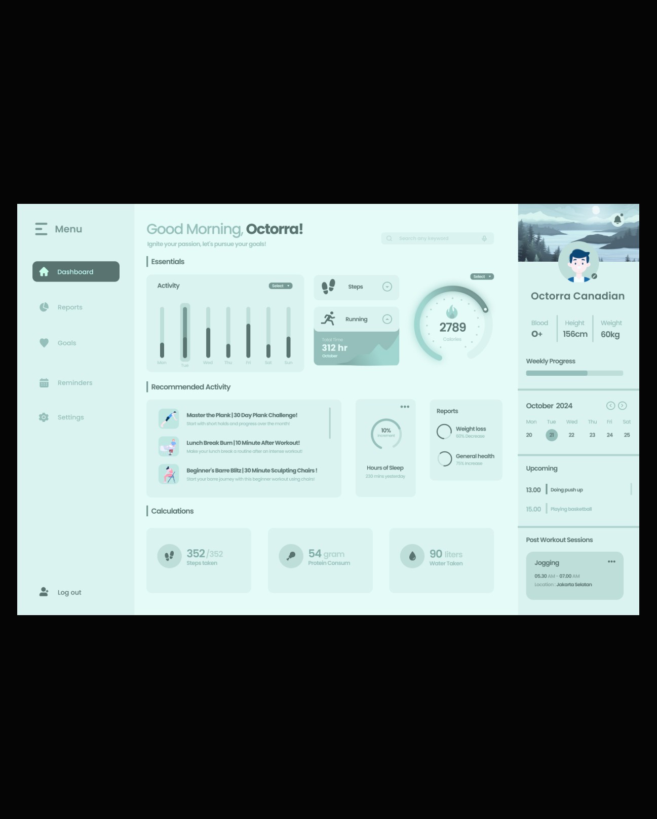
The visual identity was built on a "Mint-Teal" Monochrome Palette to signify health, freshness, and mental clarity.
Card-Based Layout: Each metric lives in a soft-shadowed container, allowing the UI to breathe. This "Modular Design" ensures that the user's eye can rest between data points.
Visual Metaphors:
The Calorie Gauge: A circular progress bar with a central flame icon, creating a visual "finish line" effect.
Activity Histograms: Used varying shades of teal to show intensity across the week (Monday–Sunday), making trends immediately visible without reading numbers.
Visual Hierarchy in "Recommended Activity": Instead of simple text lists, I used high quality 2D illustrations for activities like "Master the Plank." This reduces the "work" feeling of exercise and makes it look like a curated lifestyle choice.
The "Calculations" Section: I placed "Protein Consum", "Steps Taken", and "Water Taken" at the bottom to serve as a foundation for the day’s health, using distinct icons for quick recognition without reading labels.
Interactive Components: Added dropdowns for "Select" timeframes in Activity and "Three dot" menus for session management (Jogging), ensuring the dashboard remains clean while hiding deeper settings.
The Sidebar: A dedicated profile and navigation strip that stays persistent, reinforcing the "Personalized".

